It can be difficult for a tender response to be creative and visually interesting, as you are often required to complete a formal pre-formatted document. However, try where possible to bring your submissions to life byinserting some artistic license into the responses. Impress the buyers and make your response more pleasing to the eye and easier for them to navigate by completing the response in animaginative, on brand, easy to read style.
Font Styling
Whether or not your organisation has brand guidelines, it could be worth putting together a styling sheet which would form part of your bid library, giving you a consistent style to build submissions from. This would outline how to format headings, sub headings, when to use colour, italics, bold, bullet points etc. (read more about the basic information you should store in a bid library here).
However, when creating your styling sheet, bear in mind this kind of formatting may not be allowed in all tender responses. Check the guidelines, if they have asked you to respond in Calibri point 12 you need to do so. However colouring, bolding or italicising the font can be used to make your answers clearer and draw the evaluators attention to certain points.
Graphics and Infographics
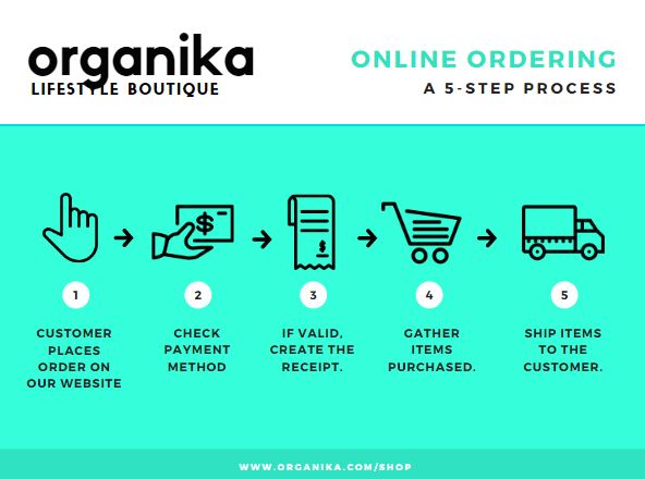
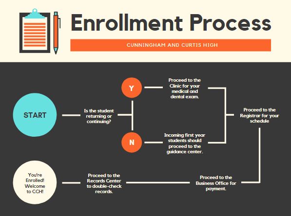
We would recommend where ever possible to display results/statistics/data in easy to read professional graphics – if you have a designer in house this is certainly something they could do or you could enlist the services of a graphic design agency.
Visual charts make data and numbers in response documents much more interesting, easy to read and importantly more memorable. Use visual charts to communicate information more effectively, for example to make an impact and simplify statistics. They are easier to understand and add credibility – show you have spent the time and effort.
Examples:
*Please note these are examples from the web and not live client examples.
Altering the way you respond to tenders to be more visual will add the edge to your response, make you stand out from the crowd and be memorable to buyers.
Photography
It is always good to be able to show real examples of what you are trying to describe. For example your branded livery, your staff uniforms/workwear and/or screenshots of reporting or management systems. Having a bank of professionally shot images, or clear screen grabs is great to call upon. Photographs don’t have to come from expensive photoshoots, use clean backgrounds and a high resolution camera phone or camera to take these pictures and save to your bid library for future use.
We agree with the adage that a picture paints a thousand words, so if you have an image, photograph or screenshot available to evidence the point you are making, adding value to the question that you are answering, we highly recommend using it.
Graphics and Images in Appendices
Where tender guidelines or formatting restrictions prevent you from including visuals in the main tender response, consider whether you can add the visual detail as an appendix. If it’s an organisation chart, a process flow,professional certification, or a Gantt chart, an appendix may work well. However to include your accreditations, memberships or standards in responses, consider inserting the relevant logos or badges it into the response itself – this makes sure you don’t have a whole raft of appendices for the buyer to look through and again keeps your response succinct, easy to read and memorable.
If you need help getting your bid library up to scratch please get in touch we would be happy to help guide you through this process or take it on for you.


